
In our digital age, where information flows at breakneck speed, clear and effective communication is paramount. Whether it’s a compelling website, a persuasive presentation, or a social media post, the message you convey goes beyond just words. The visual presentation, including the fonts you choose, plays a crucial role in grabbing attention, enhancing comprehension, and ultimately, driving action.
Let’s delve deeper into the world of fonts, exploring their impact on communication beyond mere decoration. We’ll navigate the different font classifications, discover how they influence audience perception, and equip you with strategies to choose the perfect fonts for any communication need.
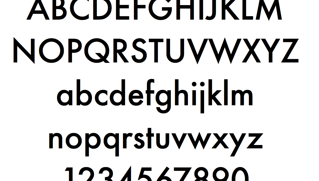
The Font Family: Understanding the Basics
Fonts, also known as typefaces, come in families. Each family encompasses a set of related fonts sharing a core design aesthetic, but with variations in weight (bold, regular, light), style (italic, upright), and width (condensed, expanded). This allows for versatility within a consistent visual theme.
Fonts can be broadly categorized into four main classifications:
- Serif: Characterized by small decorative flourishes at the ends of strokes, serifs evoke a sense of tradition, formality, and elegance. They are well-suited for legal documents, academic papers, or websites aiming for a trustworthy and established feel.
- Sans-serif: Meaning “without serif,” these fonts have clean lines and a modern, minimalist aesthetic. They are perfect for websites, presentations, or marketing materials that prioritize readability and a contemporary vibe.
- Script: Inspired by handwriting, script fonts add a touch of personality and informality. They are ideal for invitations, greeting cards, or social media posts where a playful or whimsical tone is desired.
- Decorative: These fonts deviate significantly from standard letterforms, incorporating unique shapes, ornaments, or unusual styles. While eye-catching, they should be used sparingly as readability can be compromised. They work best for headlines or short bursts of text where aesthetics take precedence.
The Psychology of Fonts: How They Influence Perception
Beyond aesthetics, fonts carry a subtle psychological weight. They can influence how your message is perceived and shape user experience:
- Serif vs. Sans-serif: Studies suggest serif fonts are perceived as more trustworthy and reliable, while sans-serif fonts are seen as modern and approachable.
- Font Weight and Style: Bold fonts command attention and convey urgency or strength. Italics can add emphasis or a touch of informality, while script fonts create a sense of warmth and personality.
- Letter Spacing and Kerning: Proper spacing between letters and the precise positioning within a word are crucial for readability. However, deliberate adjustments can create a sense of formality, tension, or playfulness.
Choosing the Right Font for the Right Message: A Strategic Approach
Effectively communicating your message requires a strategic approach to font selection. Here are some key factors to consider:
- Target Audience: Understanding your audience’s demographics and preferences is crucial. Choose fonts that resonate with them and align with the overall tone of your communication.
- Communication Objective: Are you aiming to inform, persuade, or entertain? Match your font choice to the desired outcome. For example, a formal presentation might benefit from a classic serif font, while a social media post promoting a fun event might call for a playful script font.
- Platform and Medium: Consider where your message will be displayed. Some fonts may render poorly on mobile screens, while others might offer limited accessibility options.
- Readability is Paramount: Even the most visually striking font should be easily readable. Prioritize clarity over intricate details, especially for large blocks of text.
- Brand Consistency: If you have an established brand identity, ensure your font choices align with your brand’s overall style guide to maintain consistency and recognition.
Beyond Selection: Optimizing Fonts for User Experience
Choosing the right fonts is just the beginning. Here are some additional tips to optimize them for user experience (UX):
- Hierarchy and Emphasis: Use different font sizes and weights to create a hierarchy of information. Headlines in larger, bolder fonts grab attention, while body text in a slightly smaller size ensures readability.
- Color Contrast: Ensure adequate contrast between the font color and the background color to avoid eye strain and enhance readability, especially for users with visual impairments.
- Line Length and Spacing: Break up large blocks of text with appropriate line lengths and spacing between lines and paragraphs for easier reading flow.
- Responsive Design: In our mobile-first world, ensure your fonts render well and remain readable across different devices and screen sizes.